Before And After: Mid Century Inspired Living Room
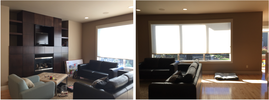
I'm so thankful for "before" photos. We take them not only to remember the space should any questions arise during our design process and also to recognize the sheer transformation once the space is complete. As the space evolves sometimes it's hard to remember what it looked like before and going back to the photos is confirmation of the degree of change.
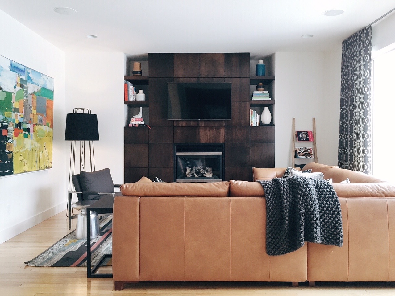
When I compared the before and after of this space I was amazed. The room had a medium paint colour, boring blinds and so-so furniture. Our clients have exceptional taste towards a mid century modern vibe, they love art, music and they requested a space to speak to their style.
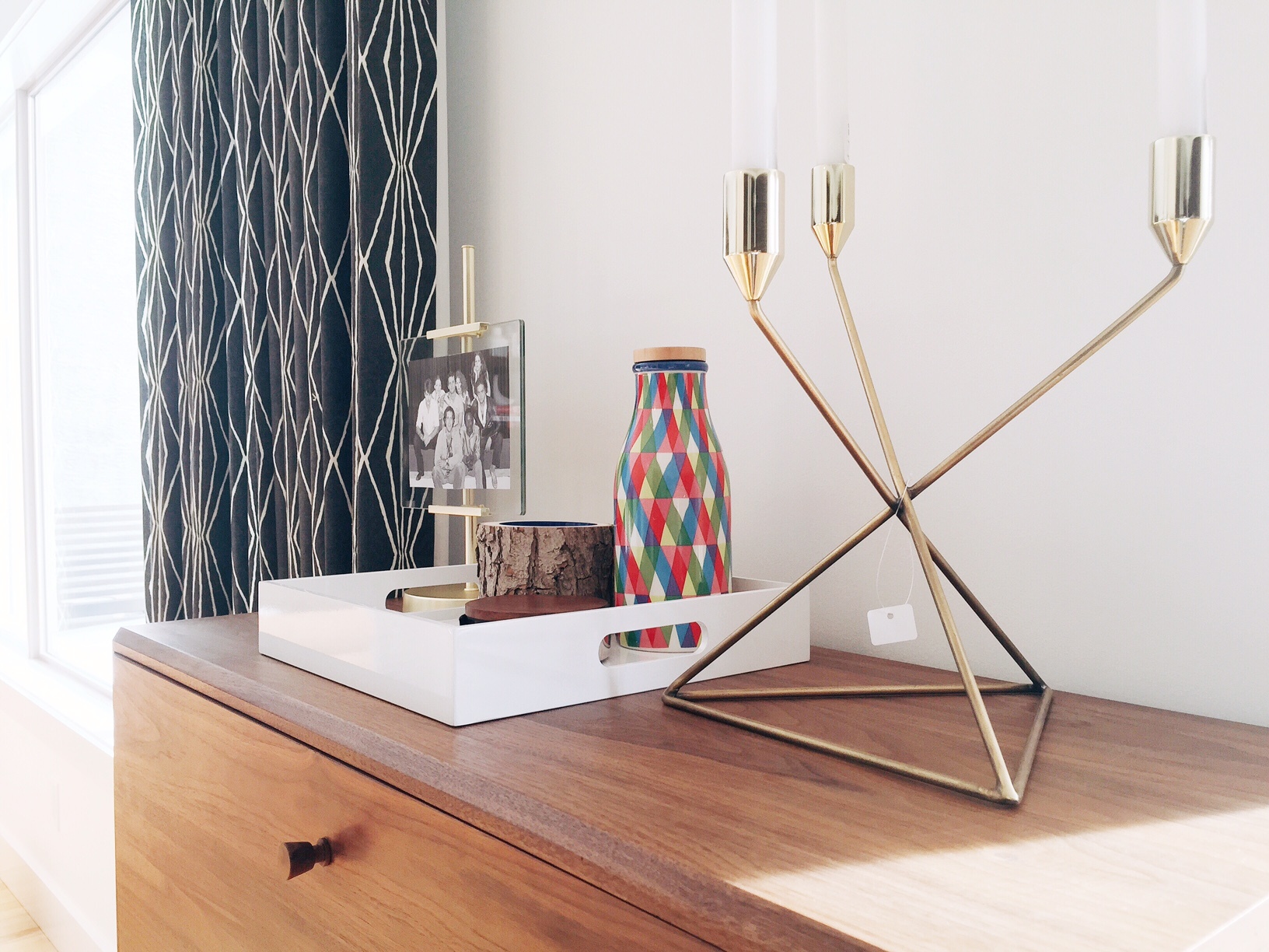
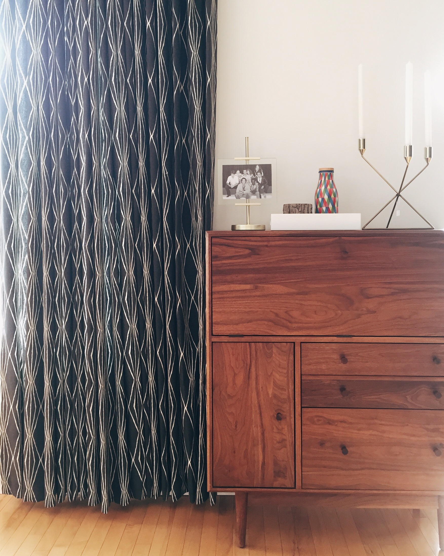
Painting the walls, ceiling and all the trim Simply White was the first order of business. This immediately created a modern feel and brightened up the space considerably. Next we replaced all the blinds with drapery, providing a graphic backdrop and framing the room.
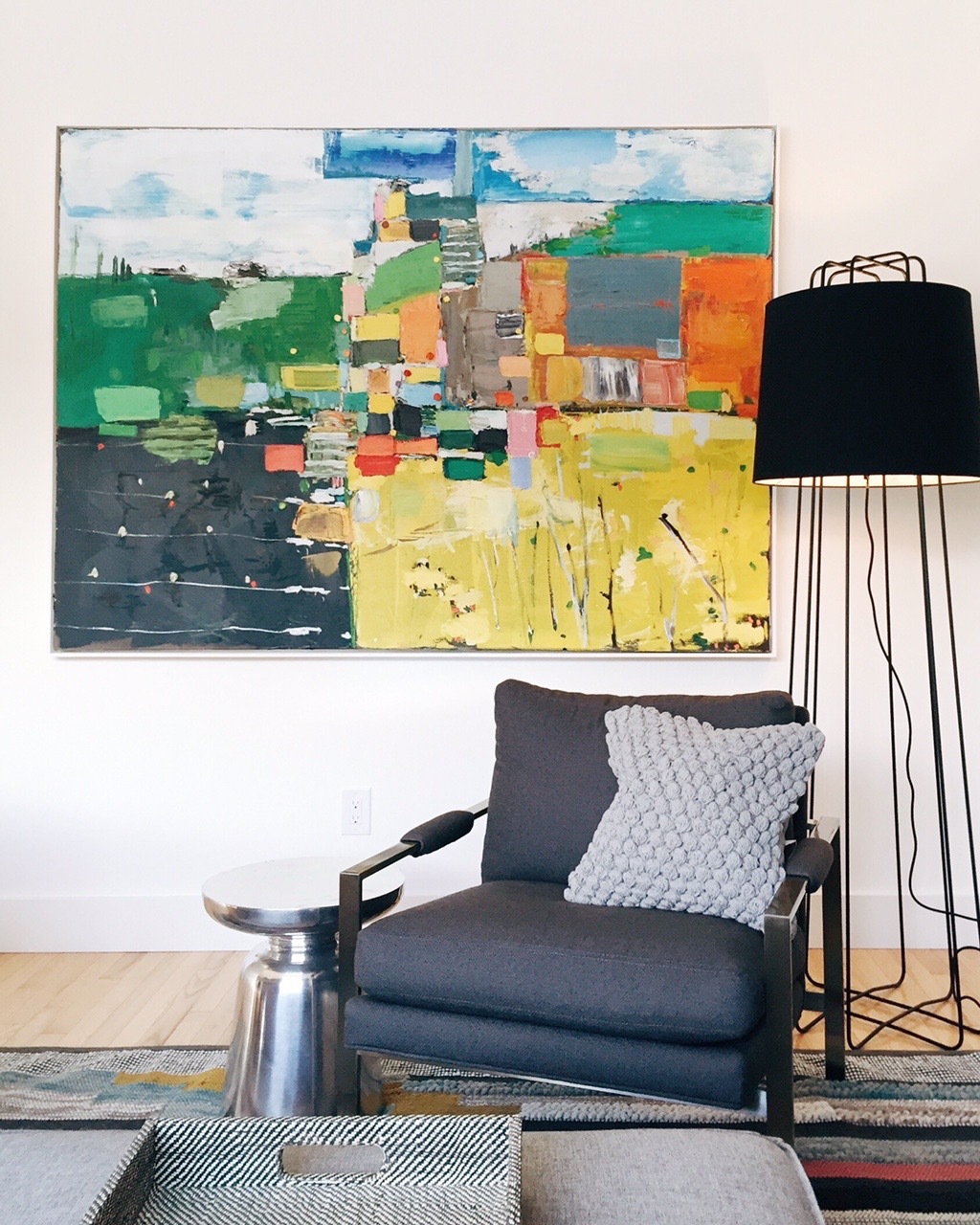
We debated over colourful accessories for the home or not, however during the process our clients purchased this artwork by Michael Adamson which we absolutely adore. We decided to allow this and the colour and texture of the area carpet to be the main voice of the room and any additional visual interest would come by way of textured neutrals and interesting shapes.
A mid-century walnut secretary was our clients own, however we repositioned it to give it more presence in the space.
Our first project with this client was a revamp of their dining room. To see that transformation click here. You'll see how the main floor now has a cohesive feel. We'll show you the master bedroom before and after soon so please check back!

