Before And After: Master Bathroom
The second of two bathrooms to be renovated in an effort to bring them up to date and more functional is revealed today. You may recall the teen bathroom we shared previously with much room for improvement with regards to function and aesthetics. For the adults of the home, their vision was to have a room of solace and relaxation with a fresh approach to materials and space utilization. The ‘before’ space is dark and dated, ready for a revamp!
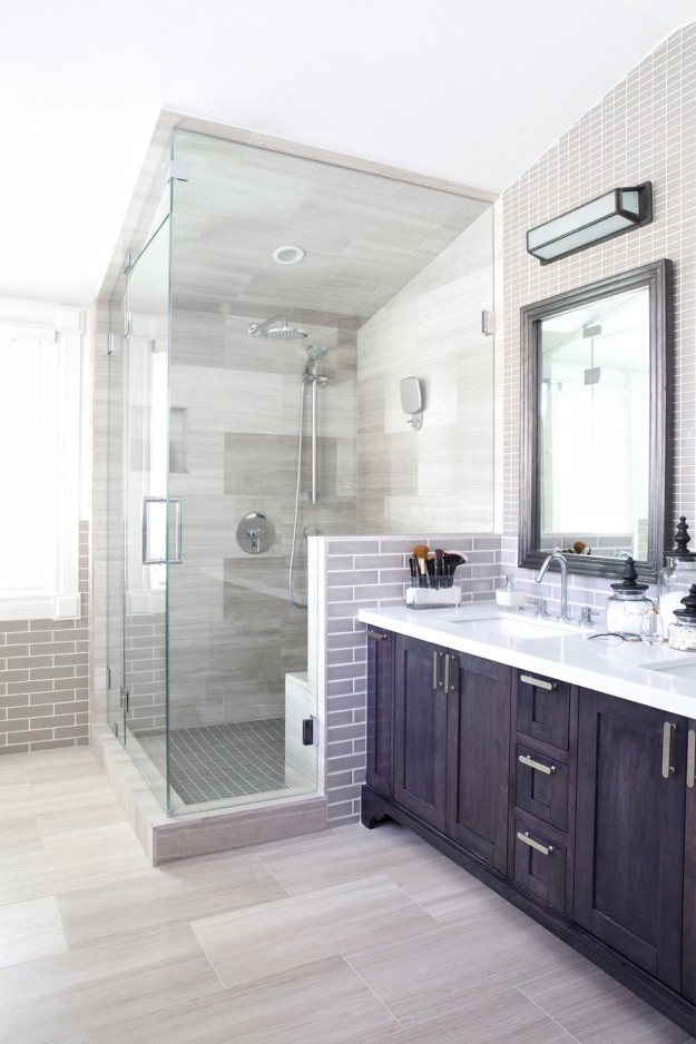
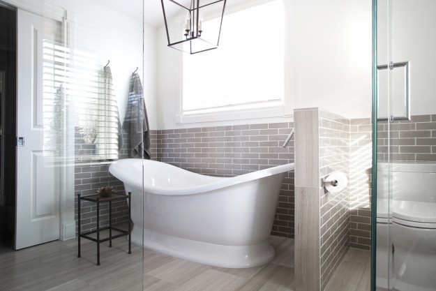
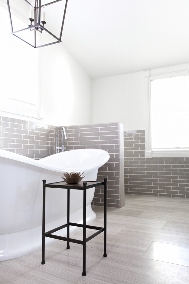
The room feels significantly larger by removing the glass block and opening the shower visually with glass framed walls. The selection of lighter tiles and the freestanding tub also opens the space and provides light to flow freely and brighten the room.
Tile was an important detail in the ensuite, not only from a function perspective but also a way of adding interest and texture in the design. We had several areas where varying tile sizes and thicknesses met each other and those areas required careful details to confirm placement and our intention for the overall look. There are six different tiles in this bathroom, however the result is seamless and textural yet still quiet and subdued in colour. A refreshing space to start and end the day.
Interior Design: Nyla Free Designs Inc. Construction: Foothills Renovations Photography: Phil Crozier


