Before & After: Nyla's Kitchen Overhaul
This overhaul was a long time coming. My husband and I redesigned this space in our heads many times over before embarking on our renovation. We love to entertain, and the kitchen being the heart of our home, always had us feeling lacklustre. Everything felt “off”. As we do with all our projects, we wanted to have a thoughtful kitchen, one designed with us in mind, how we cook, entertain and simply spend time in.
The criteria:
light but not white
a kitchen that didn’t feel too utilitarian, rather warm and inviting
highly functional
new appliances
rotate the island so it connected better with the living room
work around the existing placement of the hood fan vent
maximize storage
design a space that visually connected to the open concept main floor
BEFORE
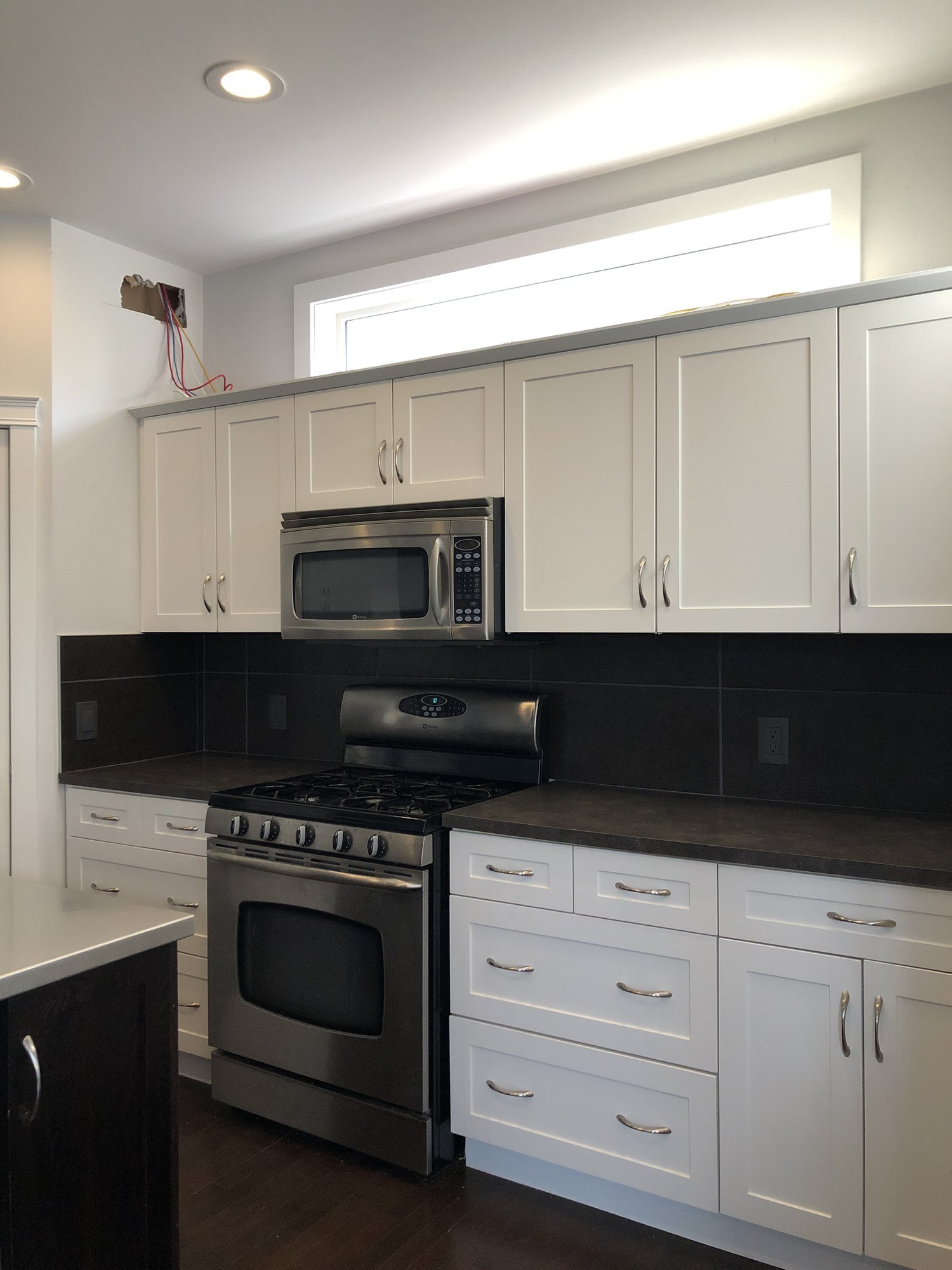
A white kitchen and dark island was all the rage in 2006, the year we moved into our home. For all intents and purposes this home was modern, and had a lot going for it. The kitchen, however, was always a frustration for our family, functionally and aesthetically. It simply never felt like “us”. The corner pantry, over the range microwave, laminate counters and appliances were all aspects of the kitchen we couldn’t wait to update. After 15 years, we were ready to revive our kitchen and make it our own.
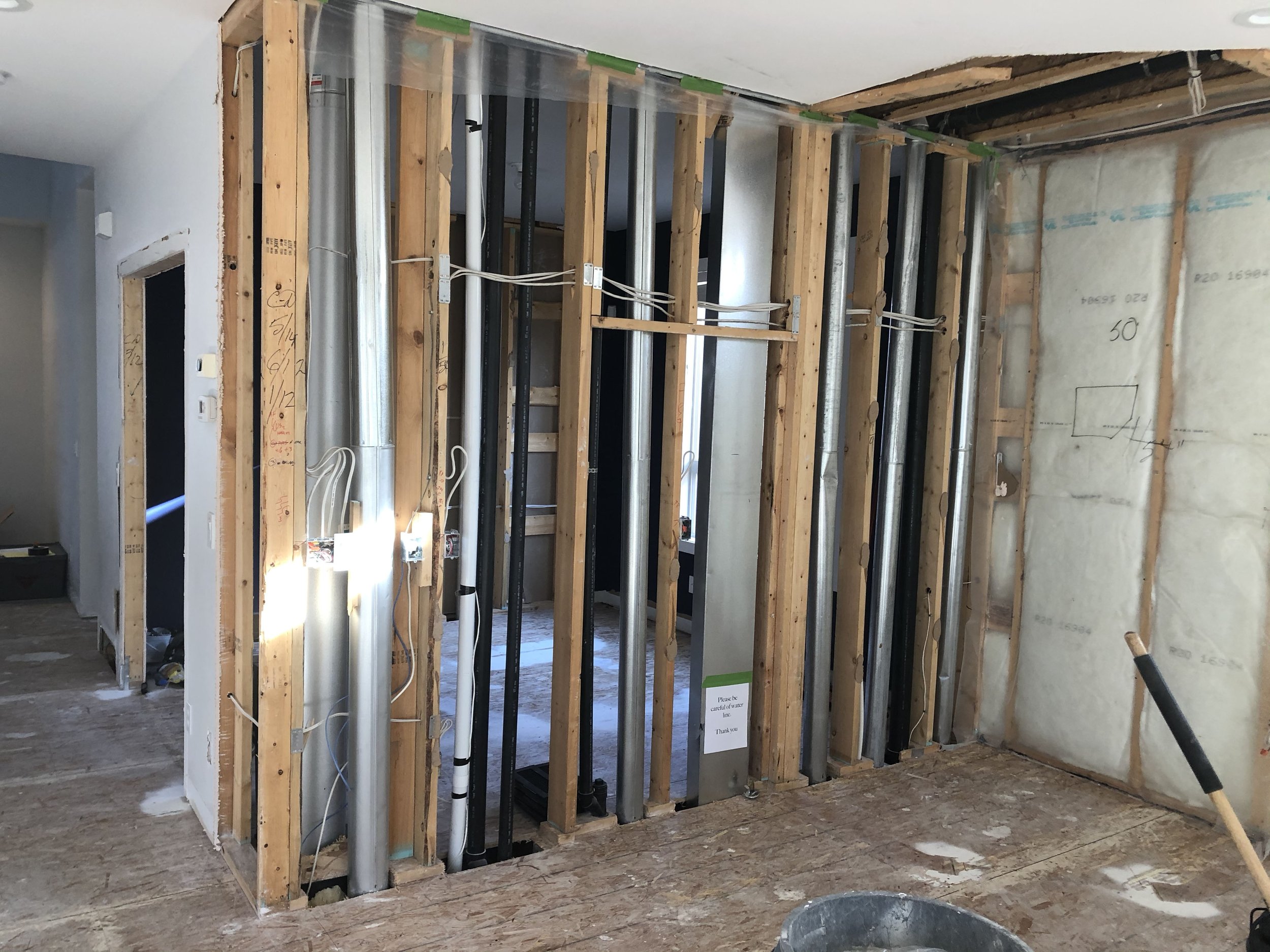
The room behind the studs and guts, is/ was our home office. It had double doors leading into the space from the hallway (shown on the left side of the image). This room became a junk collector, so the doors were always closed. It was never used as it’s intended purpose, and while there is a large window in this space, it felt cavernous and uninviting. When planning the renovation, we saw the space best used as an extension of our kitchen, and as a result, turned it into a large working pantry.
We had a transom window in the kitchen, which we closed in. While it let in a lot of light, it didn’t allow us to maximize storage and create the overall visual we hoped for. Closing it off allowed us to have cabinets to the ceiling and a traditional style hood fan over the cooktop. I am such a lover of natural light, so this was a tough decision. Zero regrets though, as this update made a huge impact on the overall look and feel of the space.
What we removed, AND MOVED:
corner pantry
microwave
transom window
home office
rotated the island
moved/ added plumbing, mechanical and electrical in order to achieve the end result
AFTER
We started our main floor renovation in the fall of 2019. In March of 2020 cabinets were going in, counters templated and appliances installed. By April we had moved back in. The timing couldn’t have been more perfect to have a brand new kitchen, when we were all locked down, and in our homes almost 24/7.
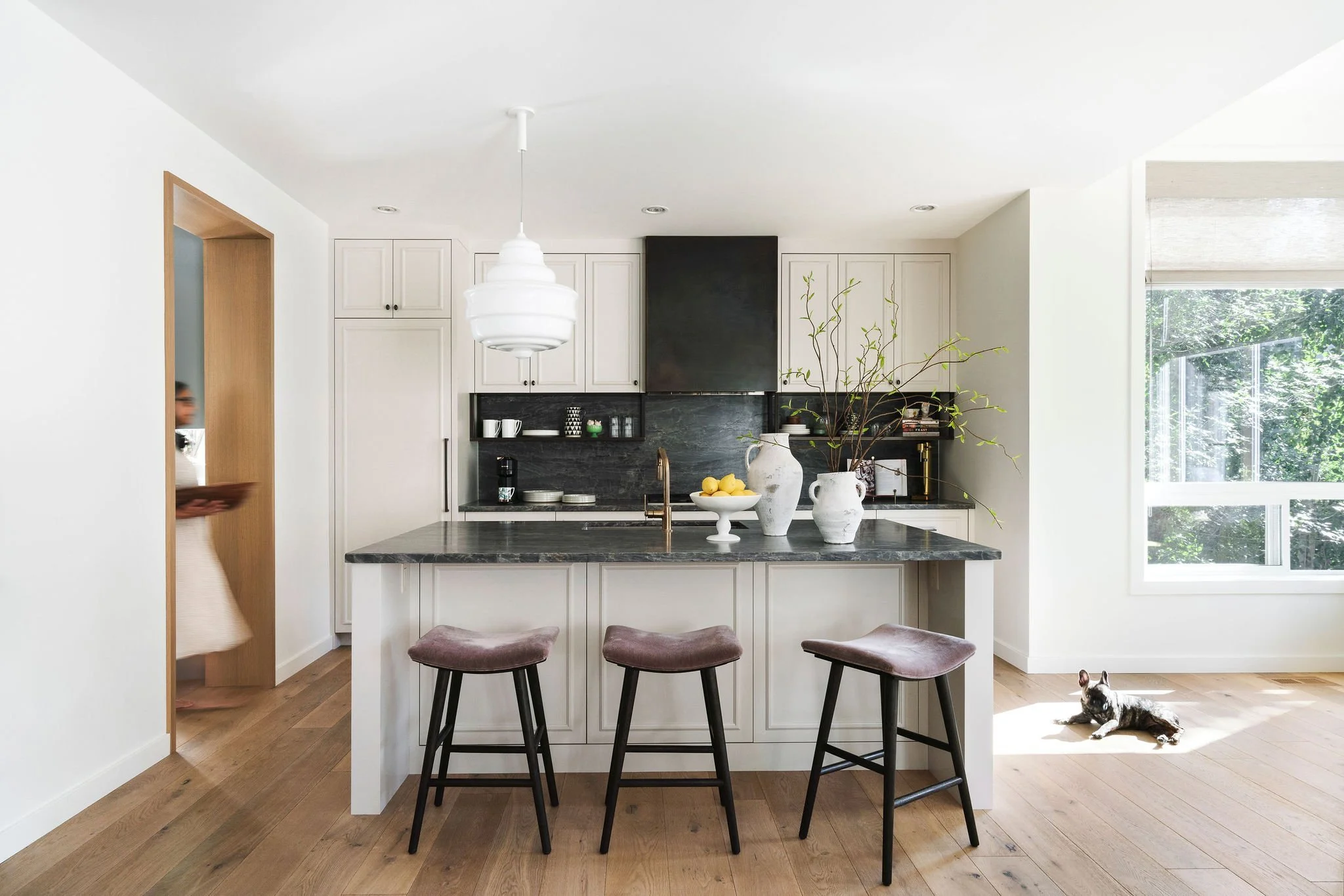
Many have commented that our kitchen feels so much bigger now. Turning the island, and removing the ‘L’ shaped layout contributes to this feeling. The overall design creates a connection to the rest of the main floor, with finishes and materials that feel good, are maintenance friendly, and offer a better functioning kitchen.
The view from the galley style kitchen through to the working pantry. Both spaces function independently, but also in tandem, depending on the menu.
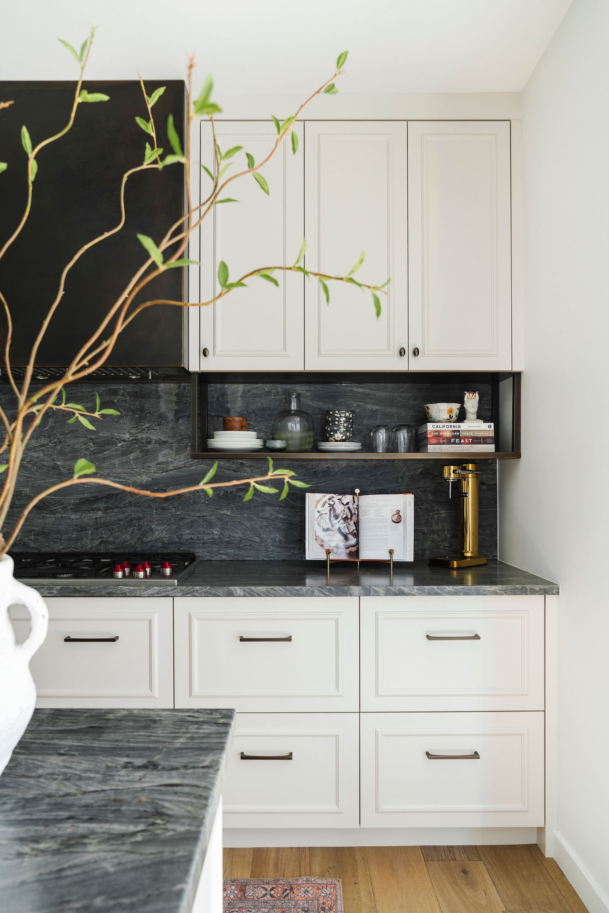
A closeup of the stone countertops, one of my favourite parts of our new kitchen. There is nothing like the depth and character natural stone brings to a space. The open shelves are also a favourite, displaying our everyday wares for easy access, as well as special items and cookbooks adding personality to our kitchen.
Read more about the story of my renovation, the ins and outs, ups and downs.


