Nyla's Dining Room: Save vs. Splurge
Through our design process, we often speak about the selections having a save and splurge thought process. Some items are investment pieces, and a love for the item or detail, it's worth the splurge. Others are carefully considered for budget reasons, and perhaps a strategy with managing costs, all the while ensuring the outcome is true to our clients.
I designed my own home with the same strategy. There was a thoughtful approach to each decision and selection, whether a hard element, or soft furnishing. As a design firm, we work in such a way that every item is selected at the same time, and presented as a cohesive package, rather than a piecemeal approach. This allows the room/ home to feel connected, balanced, thoughtful, and carefully considers budget along the way. My dining room is no exception. Here’s the lowdown on where we saved, and where we splurged.
SAVES
WALL PANELLING
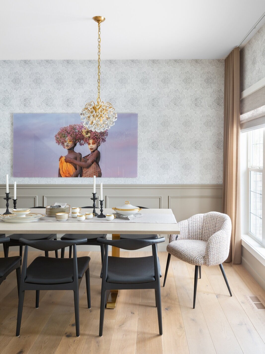
I love the detail, and layer wall panelling offers a room. I opted to add an applied moulding to the lower portion of our dining room, lacquered a deep muddy beige as a contrast to the white walls throughout the rest of the home. An applied moulding is a less expensive option to an extensive moulding and trim package, and worked well for this particular application, allowing me to “get the look”, and save some money.
EXISTING DRAPERY
Our existing drapery still worked well in our new room, with its neutral, airy vibe. We simply removed the existing drapery during the renovation, had them dry cleaned, and repressed so they would hang with proper folds. With a little effort, reusing existing items is a great way to save costs!
REUPHOLSTERED END CHAIRS
I reupholstered two chairs from our office and used them as the end chairs for our dining table, which in turn, saved us from purchasing brand new chairs.
CUSTOM DINING TABLE
While the word custom may throw you off within the category of “saves”, however this was a cost effective option to achieve a custom sized table. Our dining room is long and narrow and finding a table with the right dimensions, AND look, proved difficult. I found ready made legs, and had the top made to size from a local woodworker. The result is a perfectly sized, custom table, that didn’t break the bank.
FRAMED SCARF AS ART
There’s no question art is an investment, however not all pieces need to be original works. I found a scarf I loved, and thought it would make a great addition to our dining room. This idea did require a custom frame, however the overall price still resulted in a cost effective way to dress this particular wall.
SIDE CHAIRS
Chairs are often the most expensive purchase in a dining room. We typically allow a significant amount of the budget for chairs as 8-12 are usually required. While they would often fall under the “splurge” category, I was able to find chairs at a relatively reasonable cost, that suited the aesthetic I was after, and in turn able to manage the budget accordingly.
SPLURGES
ART PHOTOGRAPHY
As mentioned above, art is an investment, so when you find the right piece, and one that speaks to you, it’s worth the money. That’s what happened with the photograph of the girls along the main wall of our dining room table. Photographer Jane Ibbotson captured this image during a trip to Ethiopia and both my husband and I had an immediate emotional reaction to the image. We knew it was the perfect piece for our dining room and had the image blown up to 72” wide and proportionately high. It’s a captivating addition to the room!
WIRING NEW ELECTRICAL
Prior to the renovation we didn’t have any lights in the ceiling. We had inquired about adding a fixture when we first moved in; however the cost didn’t make sense at the time. As soon as we had walls and ceilings opened up, we knew it was the perfect time to make this investment and run wires for lighting. Not only were we looking forward to more light, it gave us the opportunity to add impact with the fixtures themselves.
LIGHT FIXTURES
Instead of one large fixture over the table, we opted for two medium sized pendants. They are jewels in the room, adding sparkle and a traditional err with their modern chandelier feel. Depending on the selection, two fixtures would be double the price, and in our case, an investment, but worth the cost to complete the look we were after.
FABRIC ON END CHAIRS
While we saved on reusing and reupholstering the end chairs, the fabric we chose was more of a splurge. This is a great way to save in one area, leaving room in the budget for another. Since we only needed roughly five yards of fabric, we were able to spend a little more on a fabric choice that feels special.
WALLPAPER
With an open concept main floor, we have white walls throughout. While I could have painted the walls white above the panelling detail, I wanted the dining room to feel a little different. I searched long and hard before finding the perfect floral sketch pattern, adding a layer of interest in the space and elevating the room.
CUSTOM TABLE RUNNER
Our table is long and with that, can look bare if not styled. I had a custom runner made in a reversible (lilac one side, greige on the other) linen fabric with black fringe on the ends. It adds a layer, and creates a backdrop for serving pieces, candles, vases etc., not to mention a hint of colour depending on the side I wish to have face up. The length of the table is not a standard size so “off the shelf” runners, in the style I was after were not readily available, so worth the splurge to invest in a custom piece to add a lovely detail to the space.
Twelve details, split equally between saves and splurges. share the our common practice of designing a room with both in mind. Not every items needs to, nor should it break the bank, however investment pieces are critical in making a room sing, and feel special. I love this space, and we use it all the time, whether for our family of four, for a Sunday supper, or a dinner party with a full table. It functions well, and feels good!
If you’re curious to know more about our save vs. splurge approach to design, we’d love for you to get in touch!
Hello!
I'm so thrilled to meet you. It means the world to me that you've decided to follow along on our journey here at Nyla Free Designs. We'll keep you up to date on all things design.


Nyla Free, principal designer of Nyla Free Designs, shares the save vs. splurge design approach she took with her newly renovated dining room. Learn where she saved, and where she splurged!