PROJECT REVEAL: Country House Front Entry
What colour are those doors??
There has been so much love for this space!! From shares on Instagram and posts on Pinterest, this entry has been blowing up our little corner of the internet and we’re delighted to see so many people loving it as much as we do. My heart is full just thinking about it. I don’t know if it’s the overall look and feel, one particular element but one thing’s for sure, everyone loves these doors! And we’ve received so many requests for the colour.
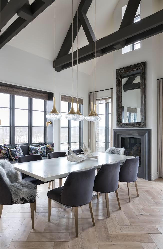
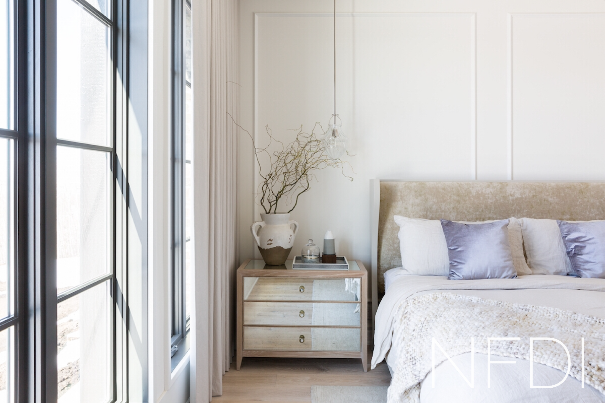
We wanted the entry of our Country House project to provide an immediate welcome and sense of anticipation for the rest of the home. Through the mix of natural materials, finishing details and lighting, alongside furniture and decor, the result is a space that draws you in and asks you to stay for a visit.
Put on the coffee, or better yet, pour a glass of wine :)
The entry itself is simple. There is a front door, a closet, a bench, an area carpet, lighting and a piece of furniture, however, with careful consideration, placement and selection, each piece now becomes a design detail, contributing to the overall aesthetic of the entire space. With the intensity of the windows throughout the home, bringing that depth of colour further into the interior was important to maintain balance and cohesion throughout. The doors are a prime example.
And here they are, practically reaching celebrity status. Can doors be tall, dark and handsome? I think so!
But the question on everyone’s mind? What colour are they??
Drumroll please…
Benjamin Moore Iron Mountain, a warm charcoal offering depth and intensity without being stark. These doors are what dreams are made of.
While the doors are certainly a show stopper, there is a cast of supporting elements worthy of pointing out.
The wall panelling detail fills both entry walls and extends to the second storey drawing your eye up and adding interest to the walls as you walk along the catwalk above.
The custom console is sure to be an heirloom.
Vintage elements such as the pottery and area carpet offer a “life well lived” feel in the space.
We paired wall sconces with table lamps to layer the light, adding detail and dimension to the room.
The wall sconces are repeated on the adjacent stone wall to light this area of the hallway, all the while connecting to the entry.
A leather bench with brass base is the perfect perch.
Every detail in this entry was thought through and very intentional. The spacing of the panel details, the placement of the wall sconces, the lighting selections and of course the overall decor details which altogether create layers of interest and a welcoming environment.


